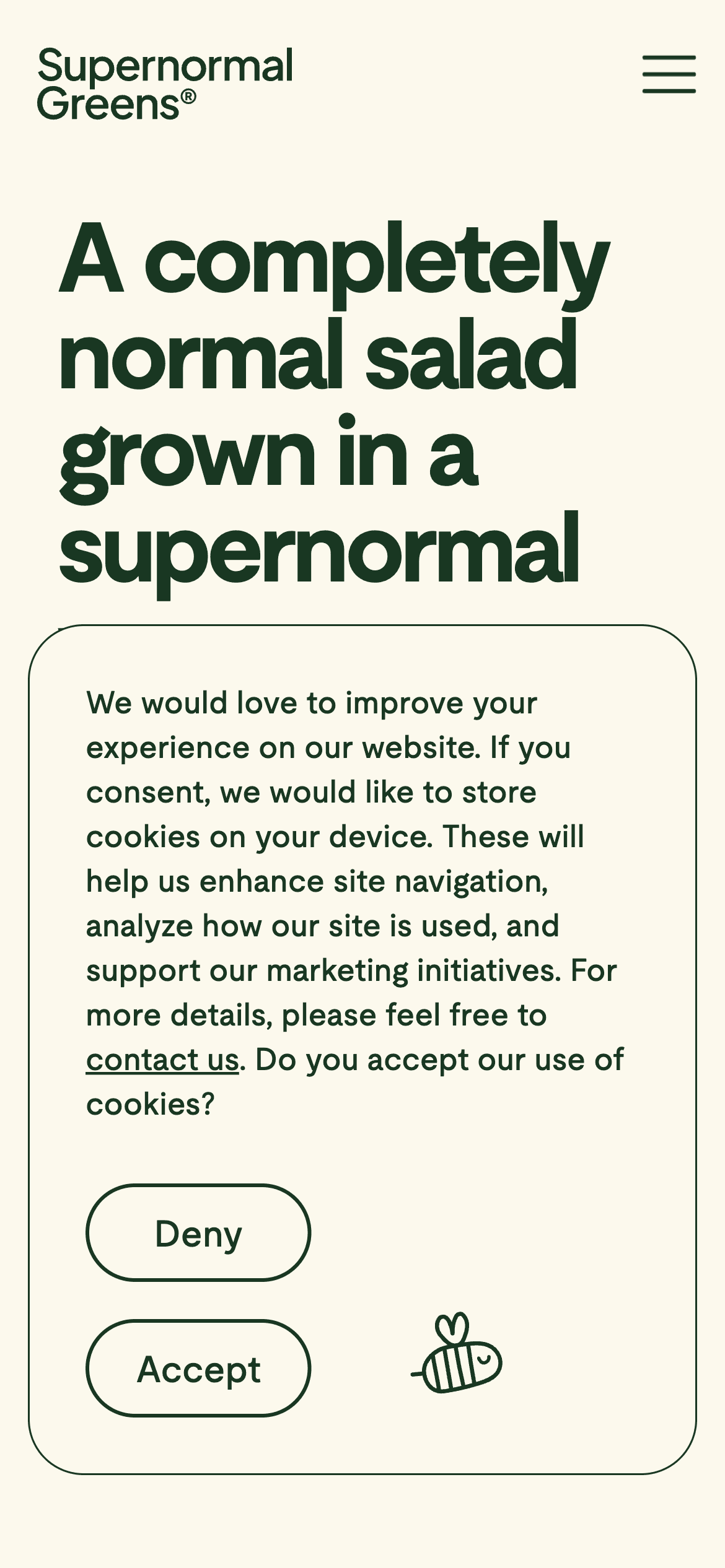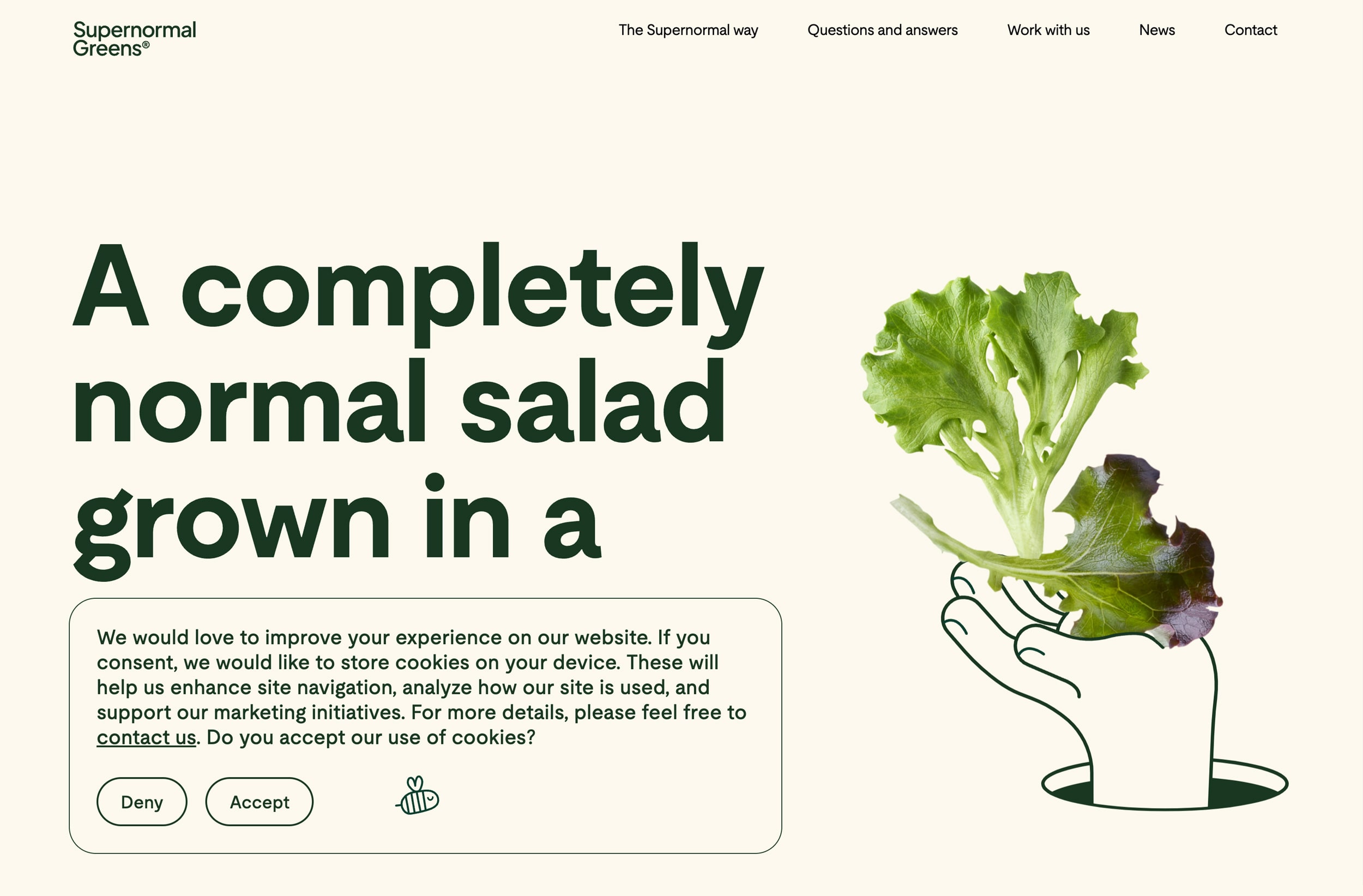
Analyzing a creative cookie banner for design and GDPR compliance.
Hovering distinctively above the page’s content, the cookie consent banner finds its home at the bottom left of the viewport, claiming a sizable portion that can’t be missed. The color palette used is a considered mix of warm beige and dark green—the latter a nod to the premise of their offering—pesticide-free lettuce.
The chosen typeface, Moderat, reminds of Spotify’s custom typography, particularly the lowercase “t” with its dramatic curve, and strikes an inviting balance between modernity and playfulness. For the cookie banner itself, Supernormal Greens uses a lighter weight version of their font which adds often missing continuity on most website cookie banner combinations.
At the banner’s foot, a line-drawn bee buzzes without sound, adding another whimsical touch. As for the message delivered, it’s clear and purposeful: the cookies are there to enhance site navigation, analyze how their site is used, and to support marketing initiatives. Yet, here the path diverges from the norm with an unconventional cue for more information—instead of the typical modal or detailed policy page, there’s an open invitation to engage directly via contact. This approach, while not incorrect, steers away from the customary route.
The banner’s CTAs—“Deny” and “Accept”—are nicely framed with hairline outlines, as minimalist as the font itself. However, the absence of a straightforward headline like “We use cookies” doesn't afford glancing quickly to understand what they’re for. It’s left up to the viewer to understand what these two buttons do—either by assumption—meaning they expected to see a cookie banner that they’d need to negotiate, or by reading the text of the cookie banner. Labels more explicit, like “Deny cookies” or “Accept cookies,” could guide the user more explicitly, bridging the gap between intuition and action.
As for GDPR compliance, is this banner in line? No. But it may not need to be based on the circumstances of the company, and its website visitors’ geographic location.
Like a well-tended plot, a cookie banner should be cultivated with care, just like this one is.
About Supernormal Greens
Supernormal, an ecocentric lettuce retailer, grows its produce all year in a circular, pesticide-free system, using just 9 liters of water per kg—far below the 80-480 liter standard. Supernormal is anything but normal, it’s the lettuce of legends.
Visit Supernormal