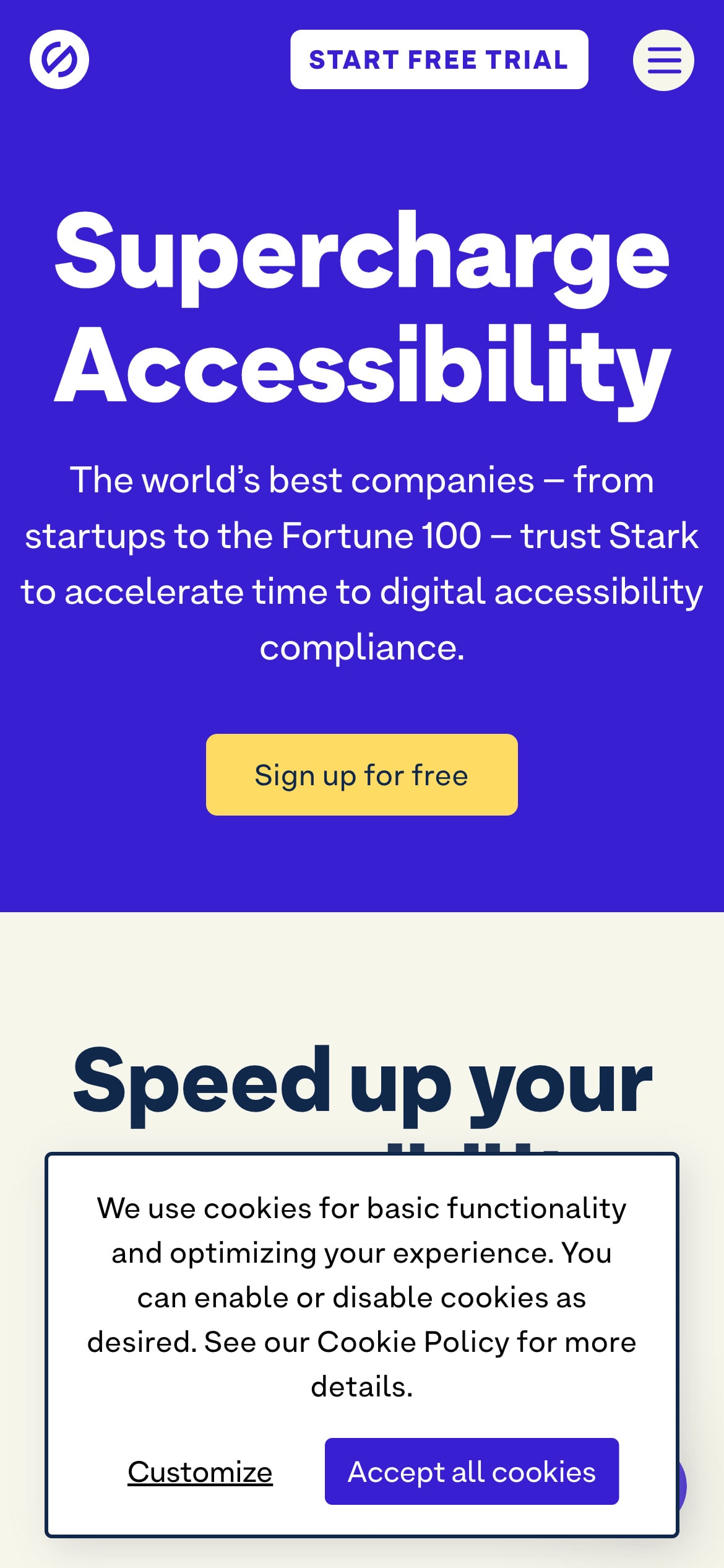
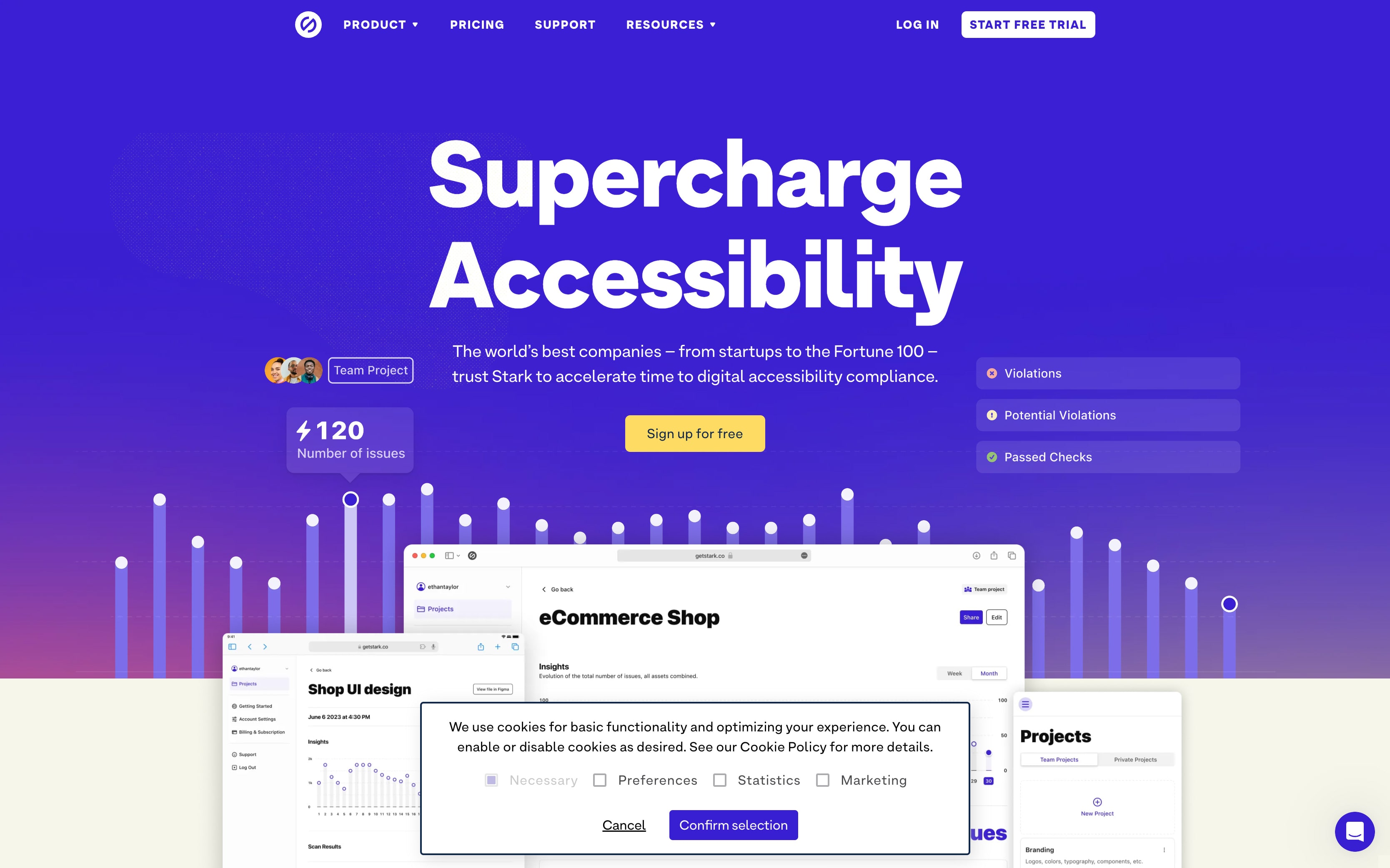
The cookie consent banner featured here is a prime example of how to execute a clear and concise design that doesn’t not detract from the user’s overall site experience.
The solid dark border framing the banner is a smart design choice, creating a distinct but not disruptive visual boundary that draws the user’s eyes directly to the banner’s message. Center justification of the text works well in this context, given the brevity and straightforwardness of the message. And, the clear calls-to-action are prominently displayed, facilitating easy user interaction.
As for color theory, the banner background is a stark :) white that complements the website’s color palette. The text color contrasts well with the background too, adhering to accessibility standards. The use of a deep blue/purple gradient in the website’s main visual elements suggest a sense of trust and reliability, which is often associated with these colors.
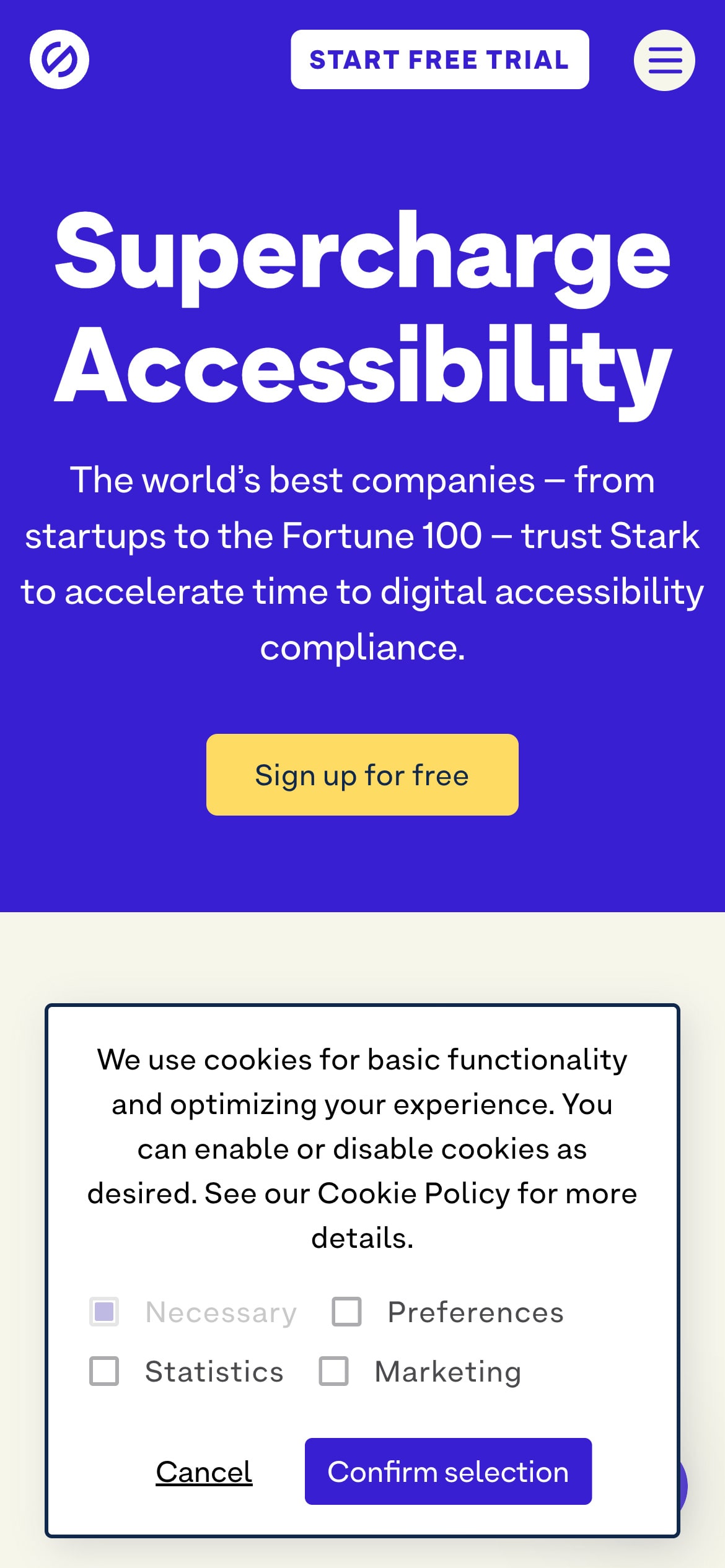
The “Customize” screen provides a user-centric cookie management option. Stark collects cookies that are for maintaining preferences, for statistics purposes, and for marketing purposes. Though some additional descriptions may be useful here, Stark is intentionally light on the details.
Overall, the design successfully creates an accessible and straightforward experience by providing just enough information to understand the implications of their choices without becoming overwhelming.
About Stark
Stark offers an integrated suite of accessibility tools designed to provide real-time insights and manage accessibility for design files, code repositories, and live applications, fostering efficient collaboration and compliance.
Visit Stark