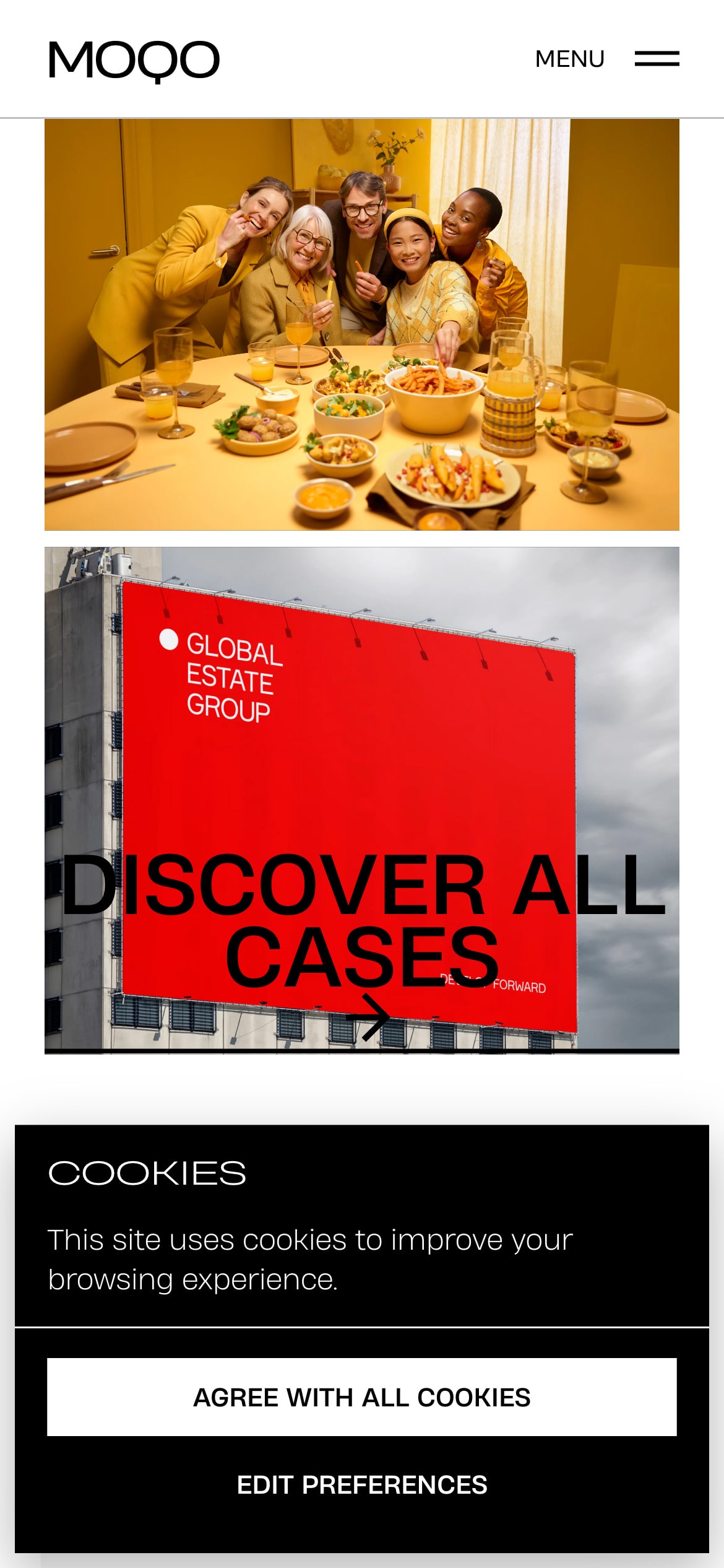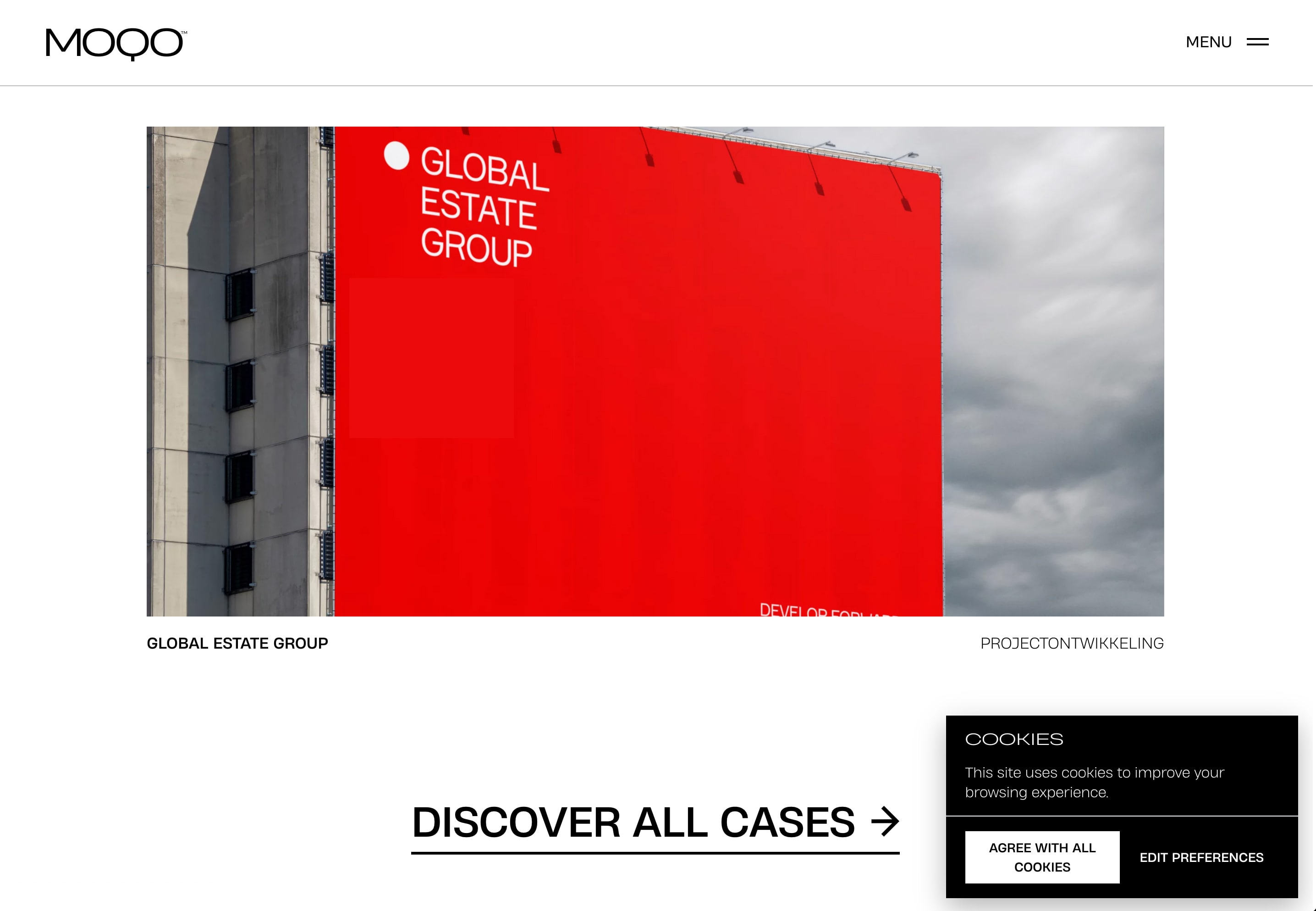
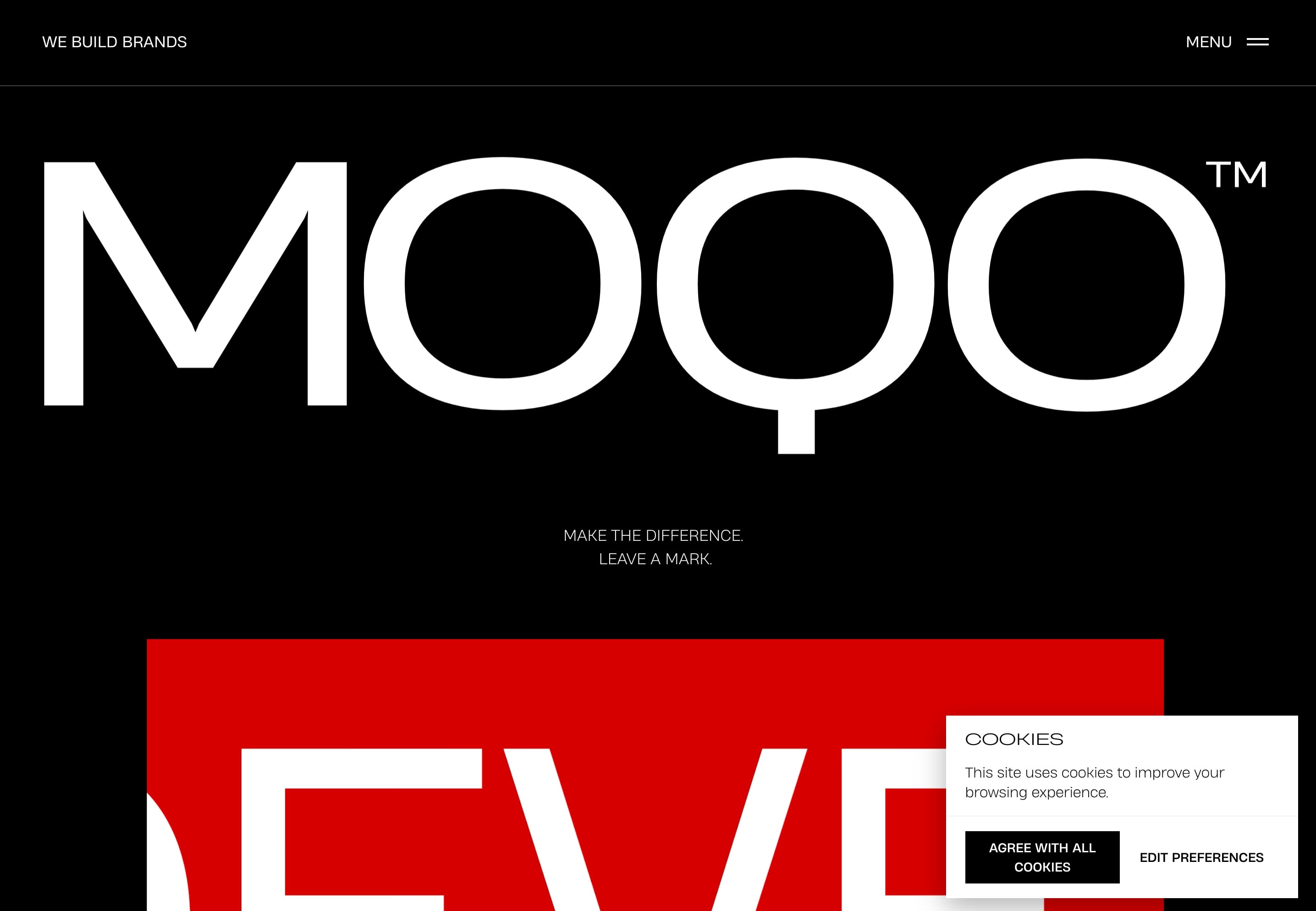
Moqo’s cookie banner is a seamless addition to the website, blending with the site’s minimalist aesthetic while maintaining its presence through a subtle drop shadow that suggests depth and encourages interaction.
This cookie banner employs an intelligent design feature where the colors invert based on the user’s scroll position. This ensures that the banner remains highly visible against varying backgrounds as the user navigates the page. It’s a functional design choice, prioritizing user awareness and interaction. Unlike a simple aesthetic preference for dark mode—which flips the color scheme to light text on a dark background—this inversion technique serves a practical purpose. It’s a user experience technique aimed at maintaining the banner’s prominence, ensuring that cookie consent can’t be missed.
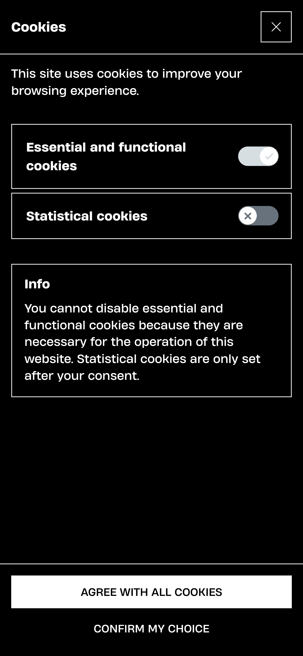
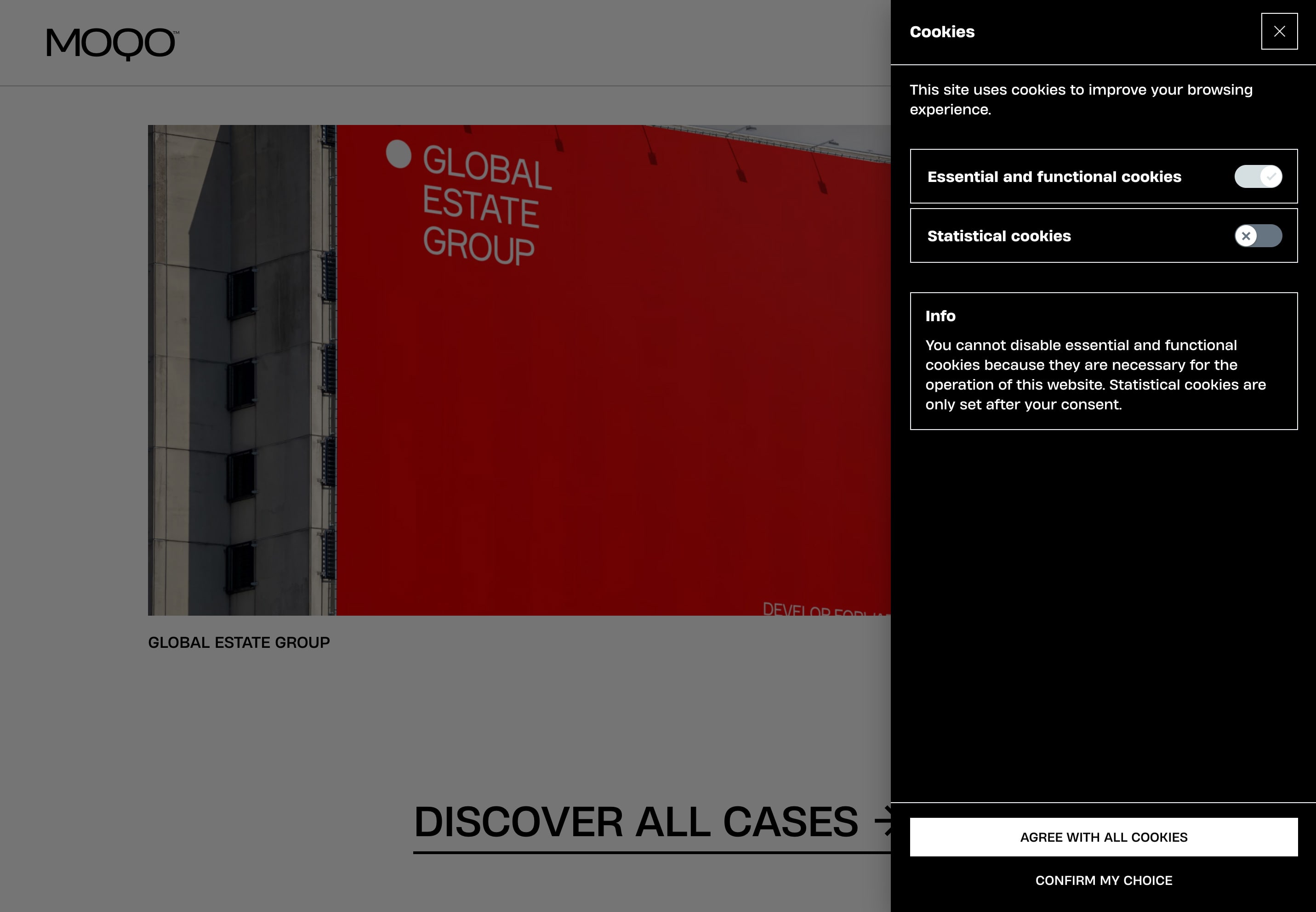
When users opt to “Edit Preferences,” the banner transforms, revealing a new vertical panel that spans the height of the viewport. Opting not to bombard users with too many details about each cookie or the consequences of accepting them right away is a nice use of progressive disclosure to maintain a streamlined interface. Thus, the expanded view provides a clear dichotomy between essential and statistical cookies, using straightforward language and easily identifiable toggles.
The black background of the preferences panel serves as a stark canvas for the white text, ensuring high readability and focus on the information presented. The calls-to-action “Agree with all cookies” and “Confirm my choice” are distinct and appropriately highlighted.
About MOQO
MOQO is a branding agency based in Belgium, specializing in creating robust brand identities and experiences through a mix of colors, alignment, typography, and visuals, including animation and video, to craft a complete and unique brand narrative for their clients.
Visit MOQO