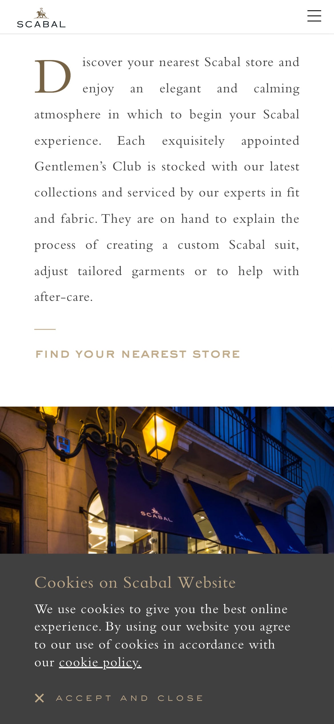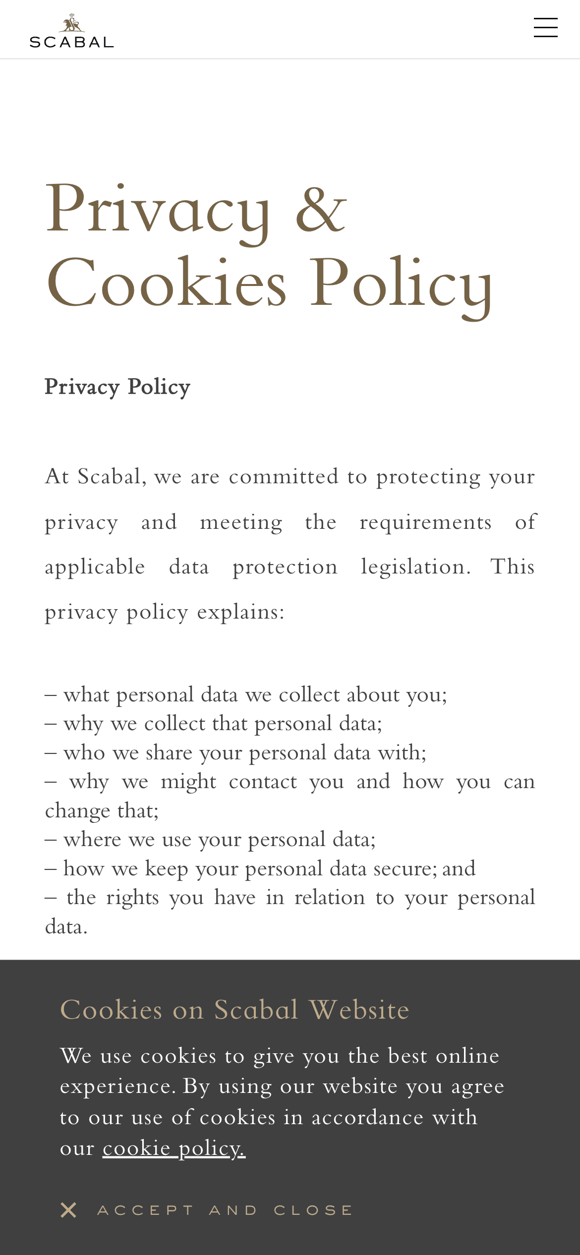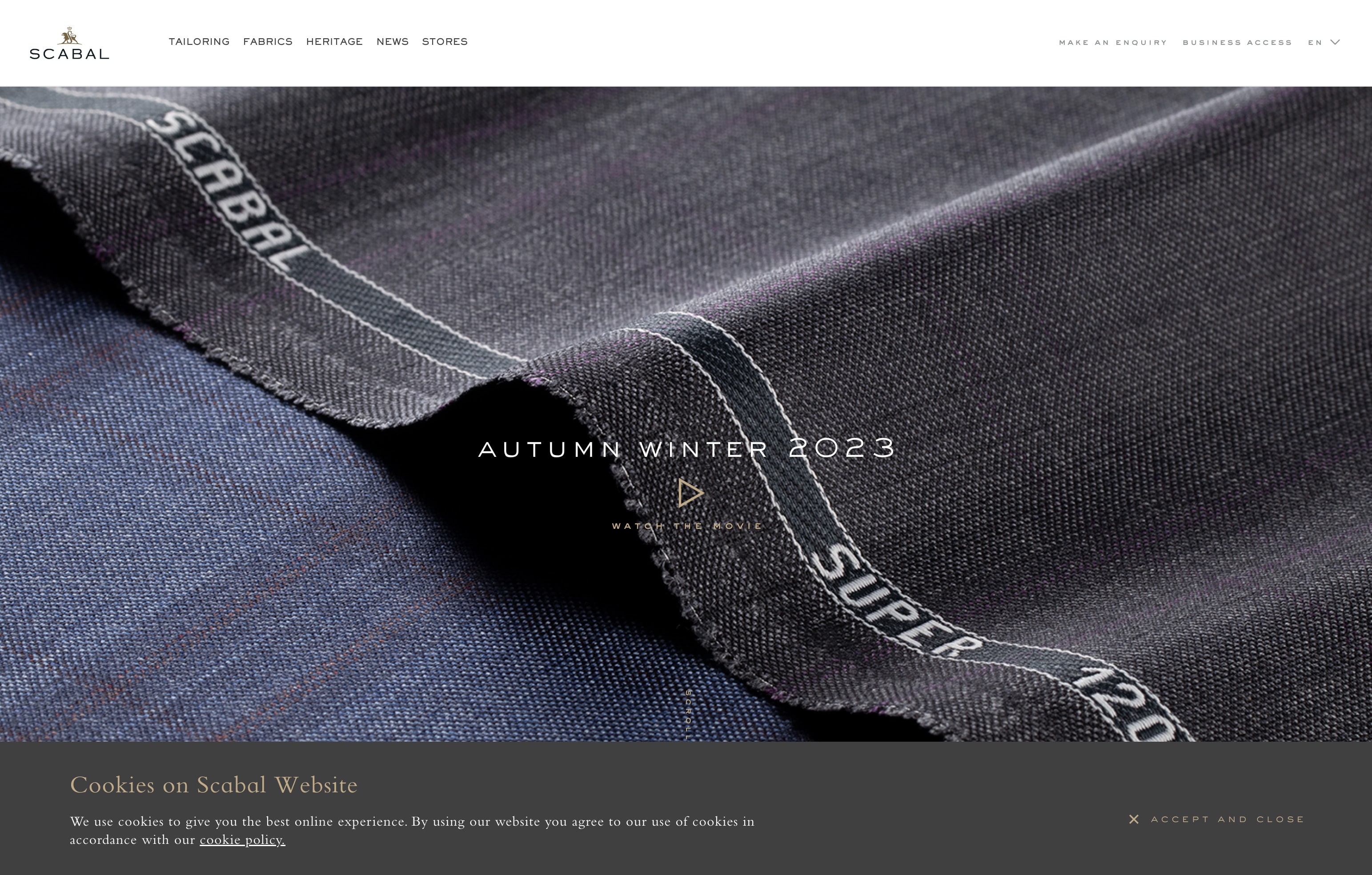
The cookie banner’s shape harmoniously mirrors the website’s primary navigation bar, creating a cohesive design element.
These elements mirror each other in an appealing inversion: the navigation bar is white with dark text, while the cookie banner contrasts in dark grey with light text. They both extend across the full width of the viewport.
The banner integrates into the overall aesthetic, with a minimalistic approach that doesn’t interrupt the user experience. Sitting at the bottom of the page, it ensures that the main visual stays the focal point. This placement respects the viewing order, seamlessly transitioning visitors’ attention from the featured content to the consent banner.
Set in deep grey, the banner supports the luxurious feel of the website, playing into the color theory that dark hues denote sophistication and lighter tones portray cleanliness.
The “Accept and close” button catches the eye as it sits neatly on the right side of the cookie banner, away from any other elements. It sports a muted gold tone that complements the darker color of the banner nicely. However, this subtlety might be a bit tricky for those with less than perfect vision. A little more contrast could go a long way in making it more visible to everyone.
Like a well-tailored suit, this cookie consent banner is tailored to fit the page’s design language, complementing rather than distracting from the overall user experience.
About Scabal
Scabal makes upscale fabrics and menswear. According to them, they’re a paragon of tailoring excellence. They’re also renowned for their impeccable quality, as they combine tradition with innovation to create timeless pieces for the discerning gentleman.
Visit Scabal