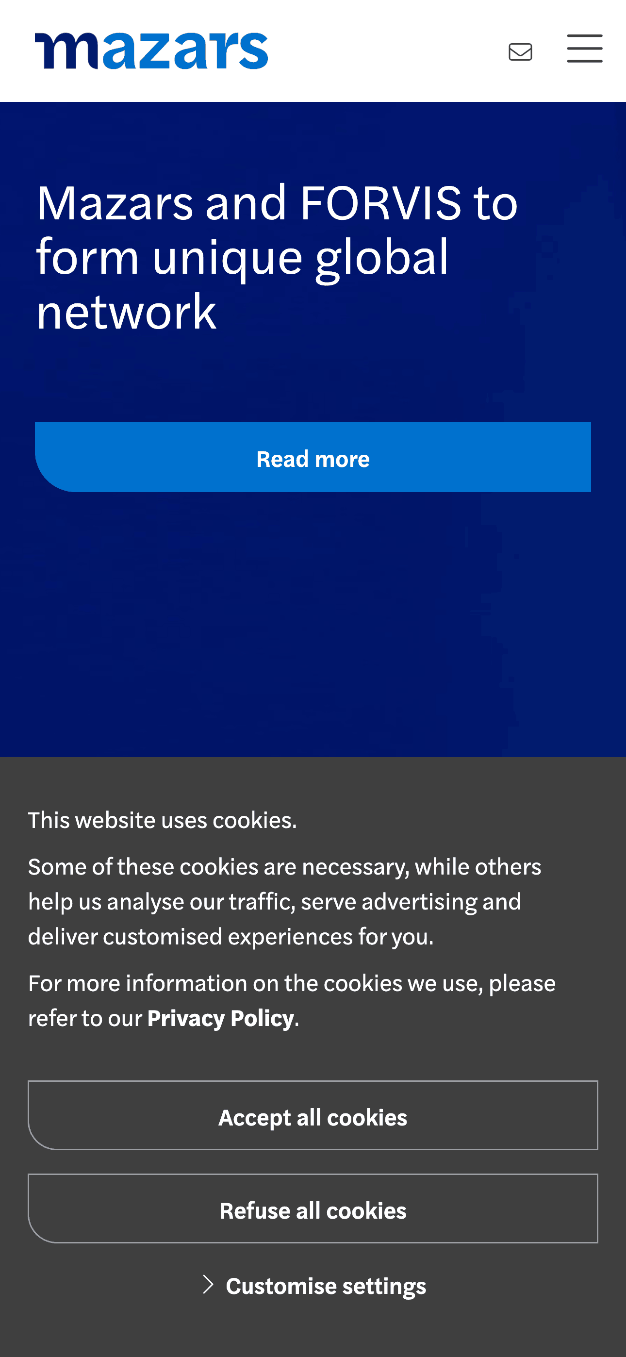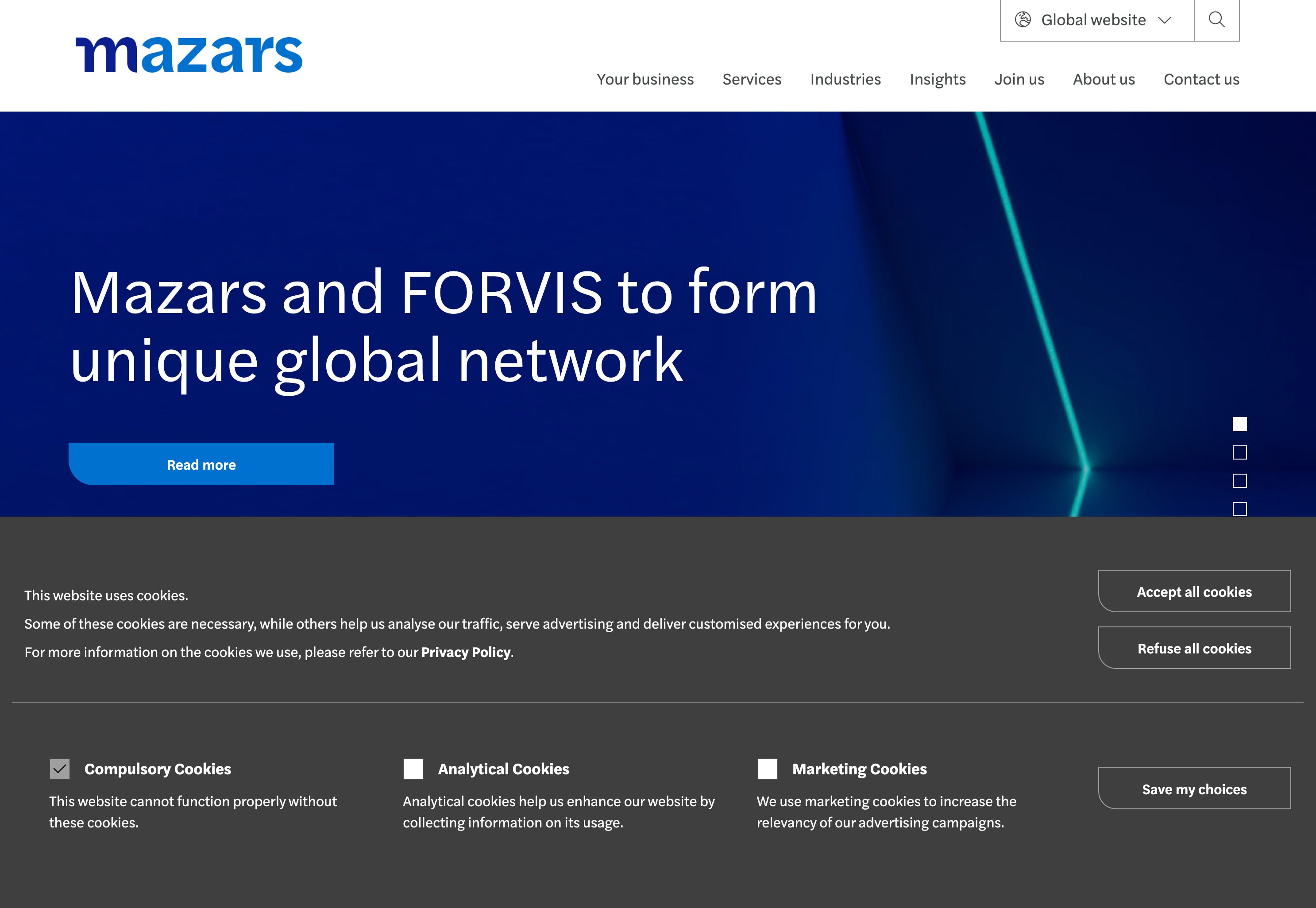
Mazars’ cookie banner means serious business, dominating the width of the page and half the viewport height, like a boardroom table.
Let’s start with the color since it’s so profound; it’s a dark gray that resonates with the professional tone of their white-collar audience. The shade gives off a sense of formality and stability, apt for the context.
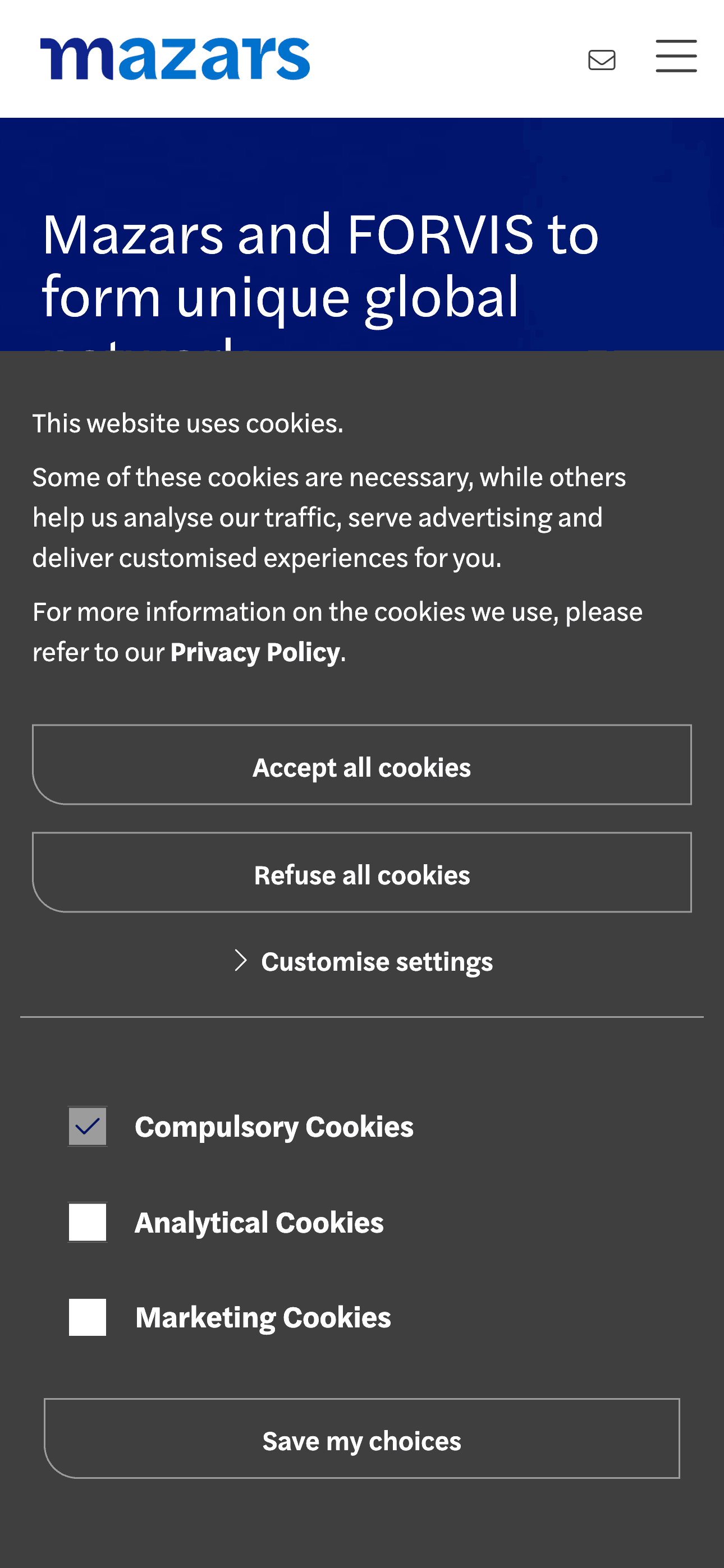
The grid within the banner is methodically organized, deviating from the typical simplistic cookie banner design. The grid’s division into text blocks and single columns effectively segments the information, aiding user comprehension. These blocks indicate that the website uses cookies, and spans multiple columns. While other information, such as the types of cookies used, takes up a single column respectively.
The CTAs, with their asymmetrical corner radii, are a welcomed nod to the brand, like a visual handshake, reinforcing brand identity and trust with every click. This detail might not only please the observant designer but also subtly enhances the overall user experience. In terms of UX writing, the button text “Accept all cookies,” “Refuse all cookies,” and “Save my choices” is direct and clear which can only help to convert.
In essence, the banner’s design doesn't just tick the boxes, it reflects a well-considered approach to cookie consent design that balances compliance with user experience.
About Mazars
Mazars is a renowned international firm specializing in audit, tax, and advisory services. They employ their expertise, global presence, and cultural insights to tailor services in audit, accounting, tax, financial advisory, consulting, and legal domains. With a well-connected network of partnerships, they operate seamlessly on a global scale.
Visit Mazars