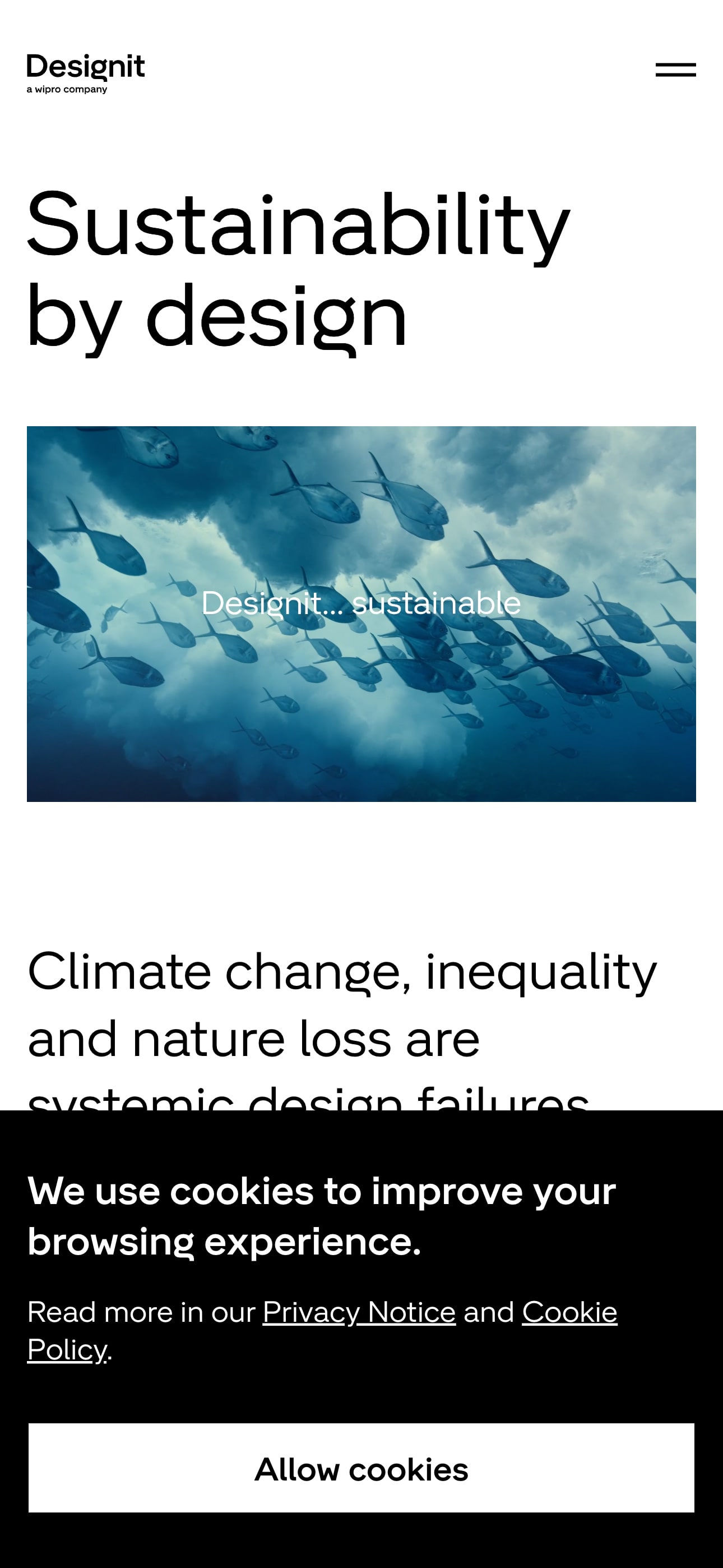
Analyzing the design elements of a cookie banner may seem trivial, but it’s a perfect example of how attention to detail can enhance user experience.
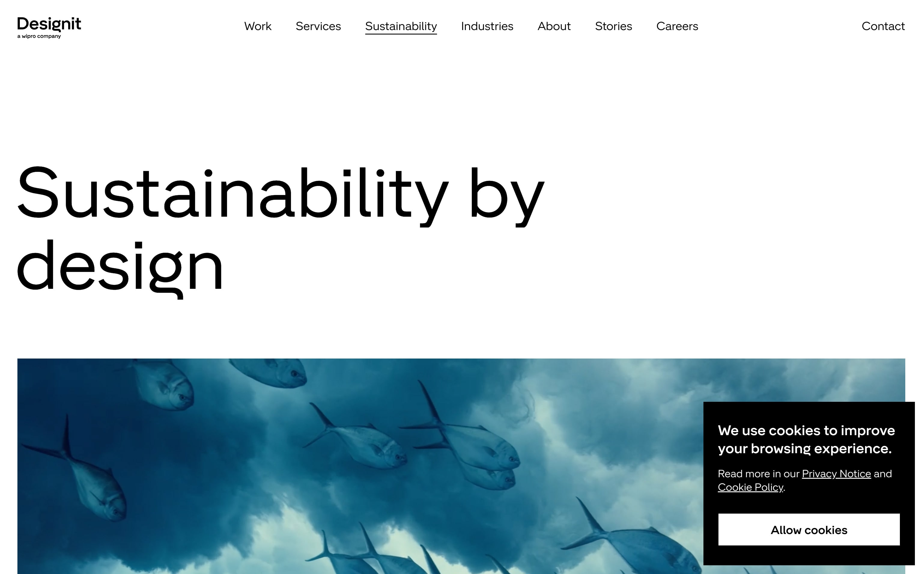
The banner is placed in the bottom right corner of the screen inside a well-defined rectangle. It nicely contrasts with the overall whiteness of the webpage. The banner’s main color, black, gives off a sense of stylishness and neutrality. In color theory, black can convey clarity and simplicity.
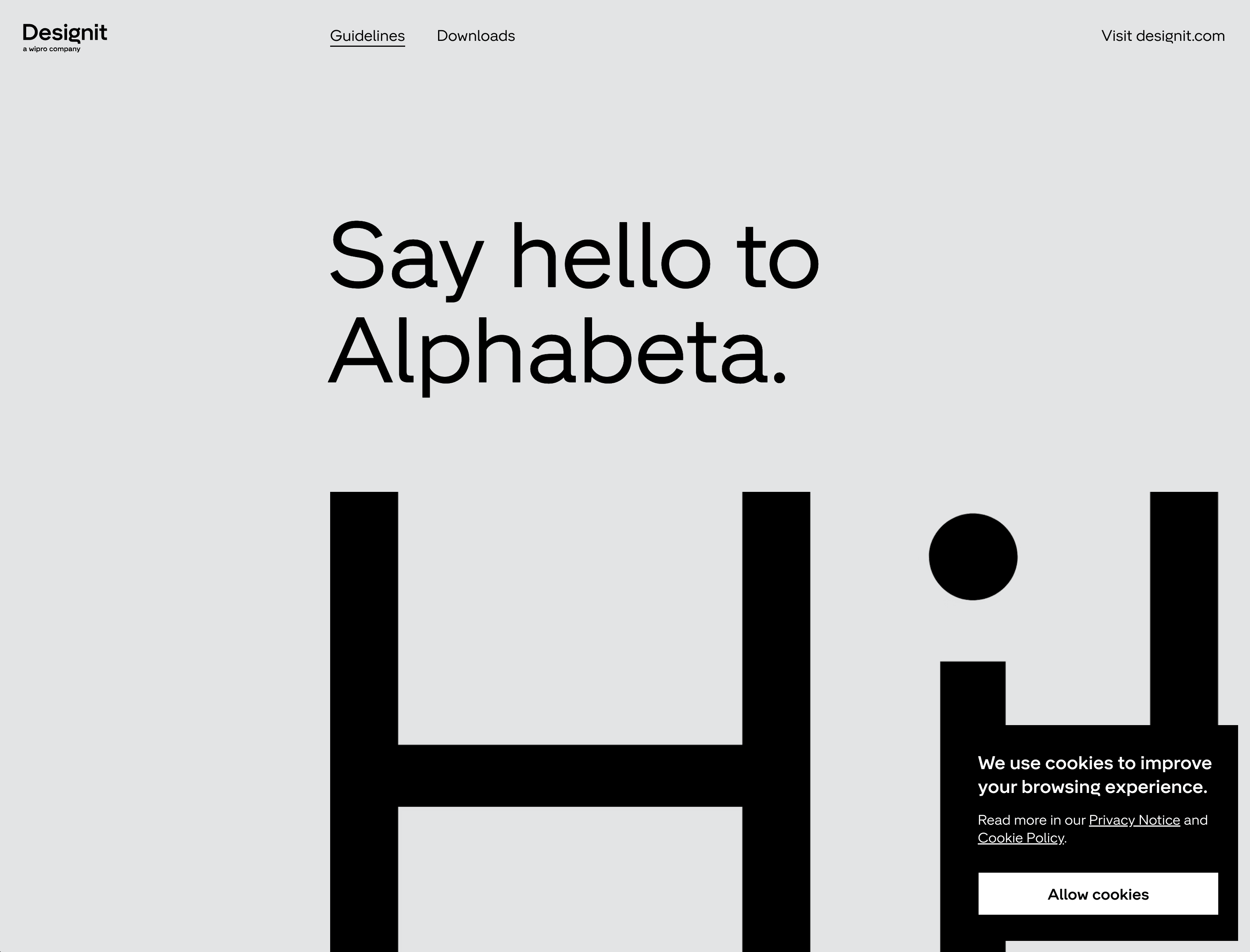
The typography used in the cookie policy is worth noting because it plays a crucial role in bringing their brand, cookie banner, and website together. They’ve chosen a font called Alphabeta, and interestingly, they’ve actually created this font specifically for themselves.
The headline “We use cookies to improve your browsing experience” is simple and is set in this custom font. The supporting body copy “read more in our privacy policy” uses Alphabeta Text, which has been optimized for smaller text sizes.
They seem to practice what they preach—hang tight, this will make more sense in a second—as their cookie banner combines both text styles and avoids shouting in all caps. This bold, sans-serif typeface in the banner stands out for its readability and modern letterforms.
The CTA “Allow cookies” is clear and direct, featuring a button with a contrasting white background and black text. No-frills UX writing, especially for vital buttons and interactions, is essential in web design. It ensures that people understand what they’re doing without questionable button labels.
Finally, if you’ve made it this far, congratulations. Designit has generously made the font they’ve used available for free to other designers! In addition, they offer suggestions on how to use it. They say, “try to avoid using all caps or title case; it just looks a bit, you know, too corporate.” Touché. Other guidelines propose simple usage, with options for OpenType features, stylistic sets, and indents for the type savvy.
This proves that making a good-looking cookie banner has its merits. With a cool font, a logical use of text styles, and a touch of visual design, you’re helping users enjoy the ride and get “there” easier, faster, and with less hassle. So, let’s give a round of applause to Designit for their generous contribution to the design community. Bravo!
About Designit
They’re an experience innovation company, with creativity at their core. Designit produces strategy, design, marketing, and technology projects. Their focus, however, is on brand marketing in order to help customers connect with audiences. Their approach uses data to inform marketing decisions and deliver results.
Visit Designit