This cookie banner and the website? They’re tight.
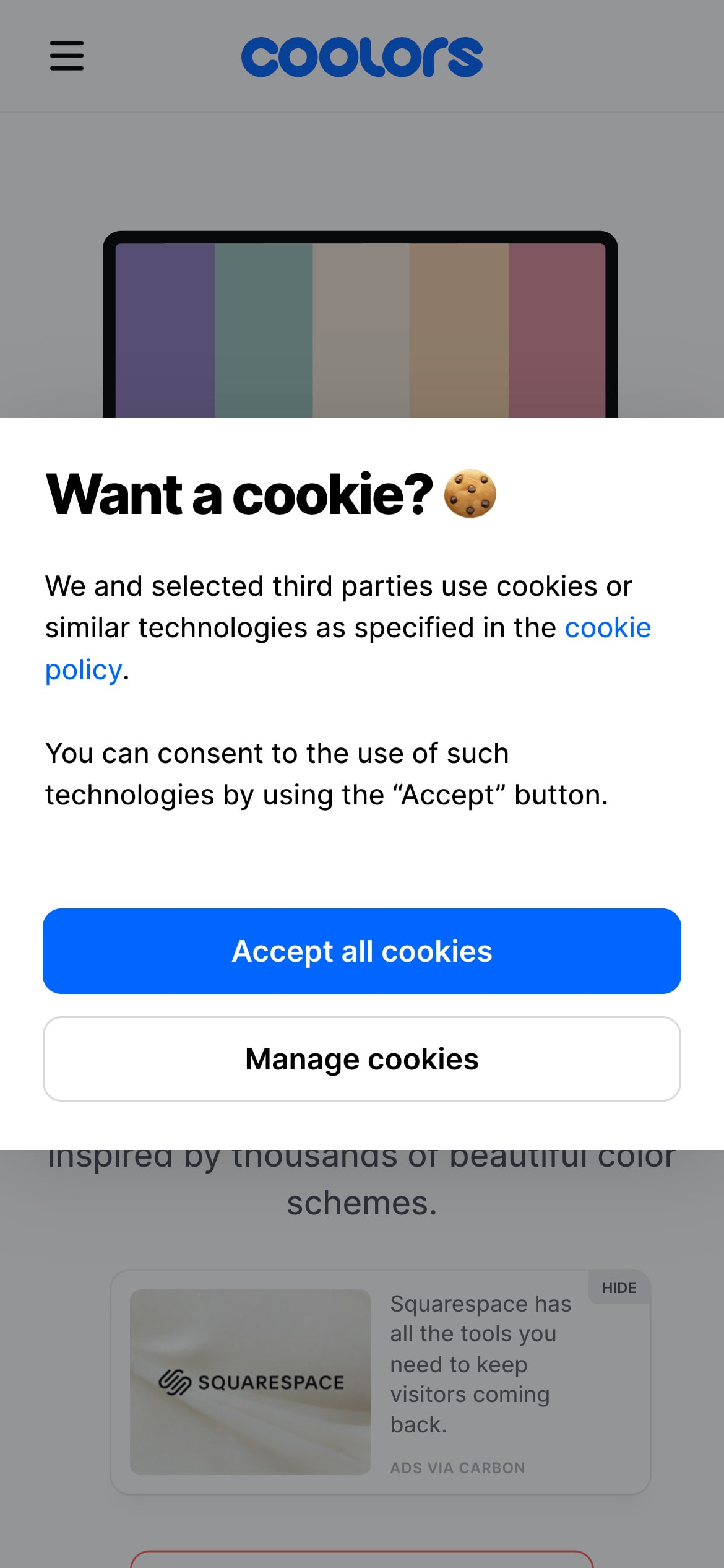
When this cookie banner appears, it takes center stage as an overlay, dimming the background. The banner is white and softly rounded at the corners and features two options: the “Accept all cookies” button in a striking blue and the less emphasized “manage cookies” in white with a gray outline. Using color to prioritize certain actions in this manner is both common and effective. Coolors’ banner doesn’t just catch the eye—it cozies up to your trust instincts with their use of blue. Here’s how.
Blue is often associated with trust, reliability, and professionalism. The psychological impact of this hue aligns well with the action of accepting cookies, which requires a level of trust from users. By choosing blue for the primary action, Coolors not only makes the button stand out visually but also taps into its inherent trustworthiness.
Coolors also informs users about its use of third-party cookies, which is notable given Google’s move to replace them with “trust tokens”—a new, non-personalized technology for authentication. But, we’re getting off track.
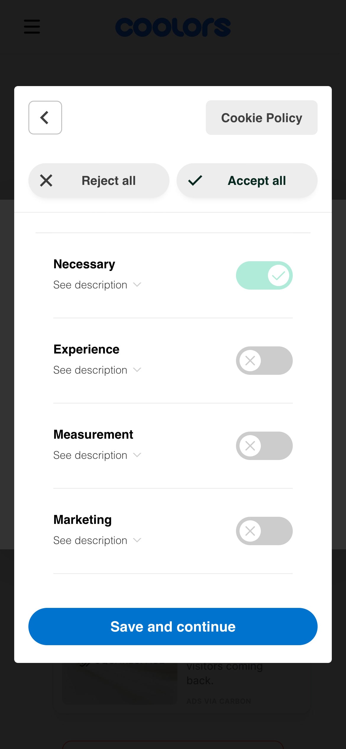
Upon choosing to manage cookies, users encounter a second overlay, which dims the background further. This layer presents more detailed options. From a UX design standpoint, separating this information is wise, as overloading users with too much initially can detract from the design’s effectiveness.
In essence, this cookie banner is not just a functional necessity, but a masterstroke in using color psychology to enhance user experience and trust.
About Coolors
Coolors is a color palette generator that designer’s can use to jump-start or improve their digital color schemes. They have a chrome extension, iOS and Android app, Figma plugin and an Adobe extension.
Visit Coolors