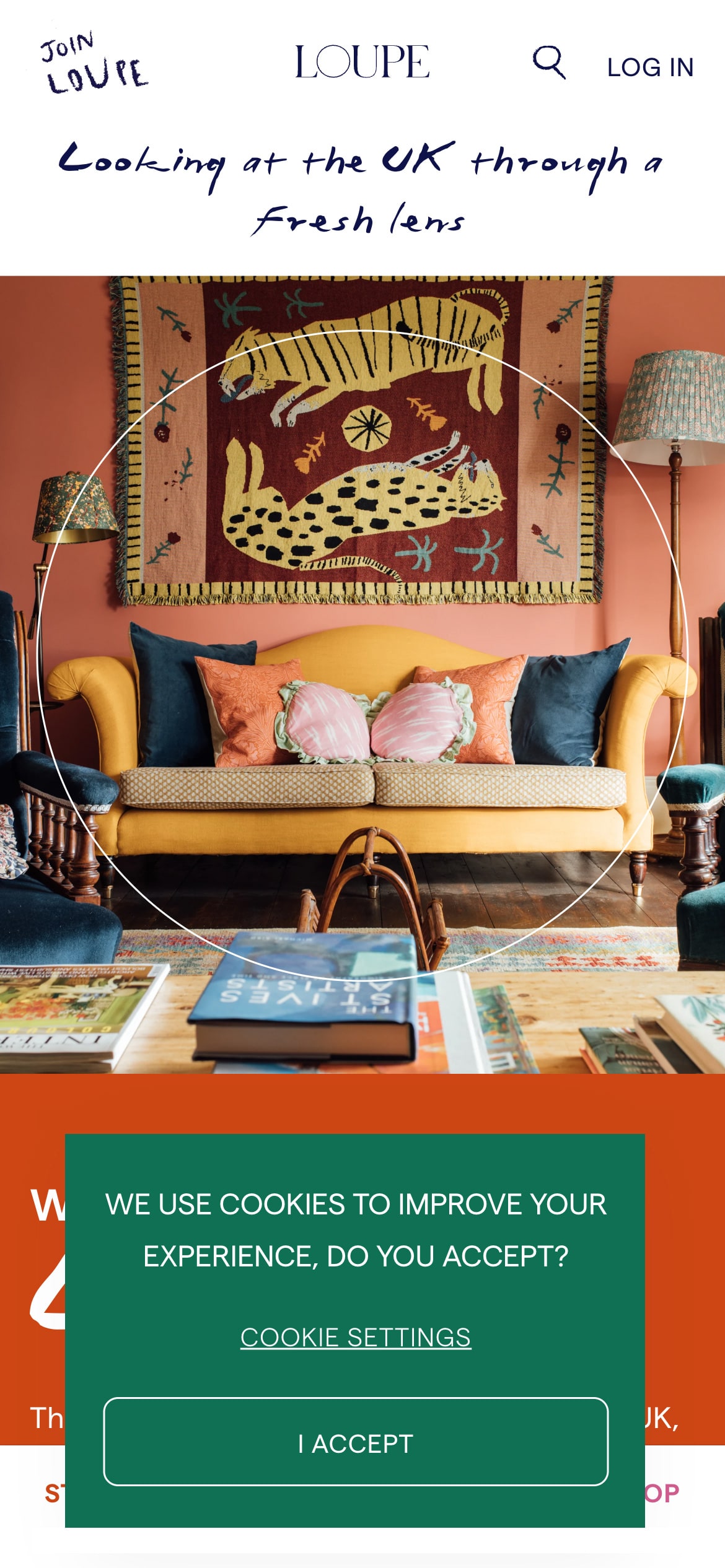
The banner sits in the bottom-left corner, giving it a presence that nicely wraps up the familiar “F”-shaped reading pattern often found in web design.
To explain further, users typically scan a webpage in an “F” shape. They start by reading horizontally across the top, then move down a bit and continue reading in shorter lines. Finally, they skim vertically down the left side of the page, creating a pattern resembling the letter “F.”
The banner’s language is straightforward, with the message “we use cookies to improve your experience, do you accept?” serving its purpose. This simplicity isn’t likely to deter users who usually want to engage with a website’s main content quickly, making the single “I accept” CTA effective in this decision.
Design wise, the thin outline of the button calls back the banner’s thin font weight, creating visual consistency between the two. The green color of the banner, reminiscent of jewel tones, suggests luxury and complements the website’s audience who are navigating options for shopping and dining. This hue, set against the orange background, forms nearly a split complement—split complements are colors that are adjacent to their opposite on the color wheel.
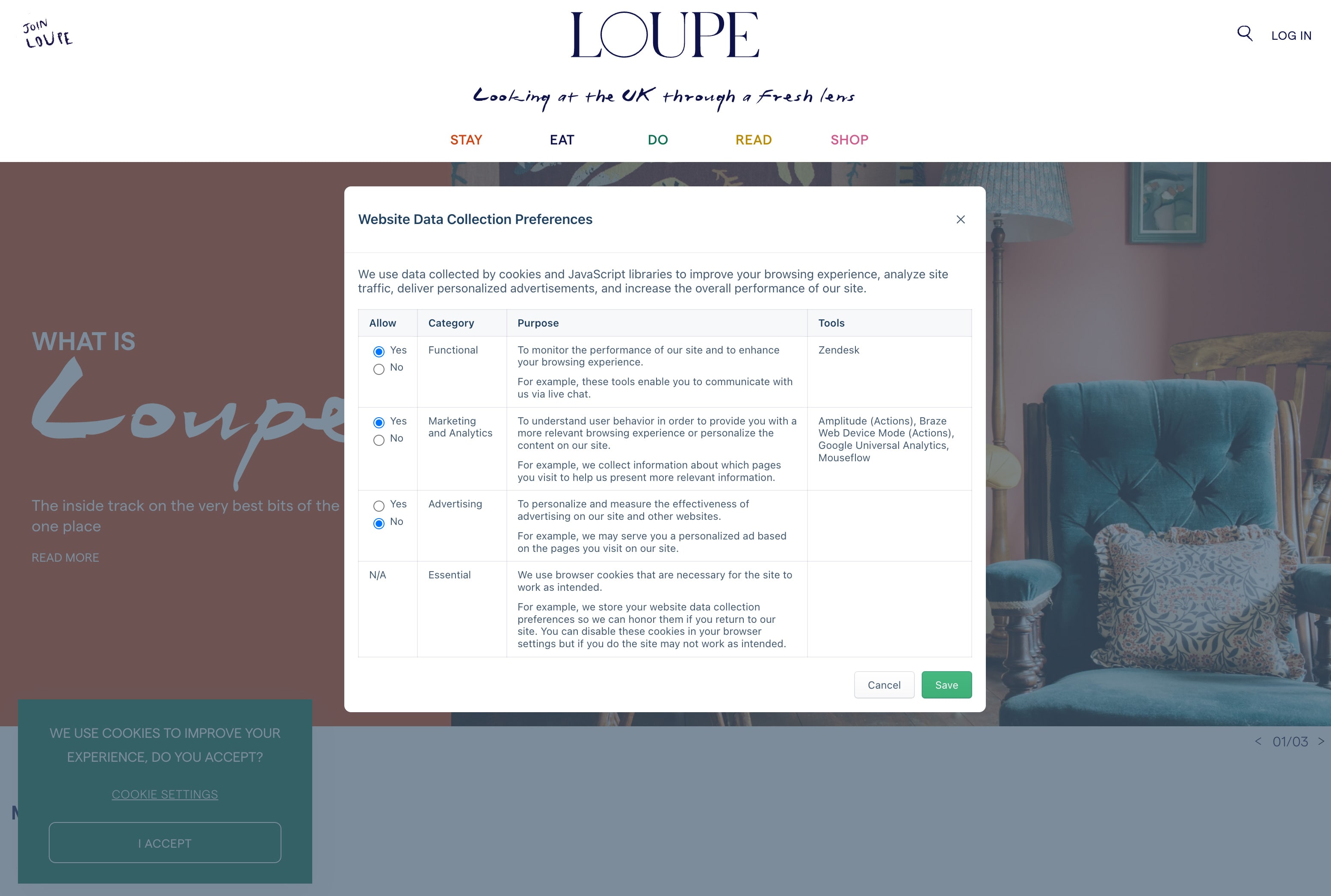
On the cookie settings screen, a modal overlay covers the entire page. Loupe chose to lay things out in an old-school table style. The good news is that the types of cookies they collect are straightforward, with radio buttons for easy enabling or disabling. However, the “Cancel” and “Save” buttons at the bottom contribute to a somewhat dated appearance. Perhaps they could benefit from a design that mirrors the style used in the primary cookie banner. For instance, the “Save” button’s green color should match the background’s color and flatness in the cookie banner.
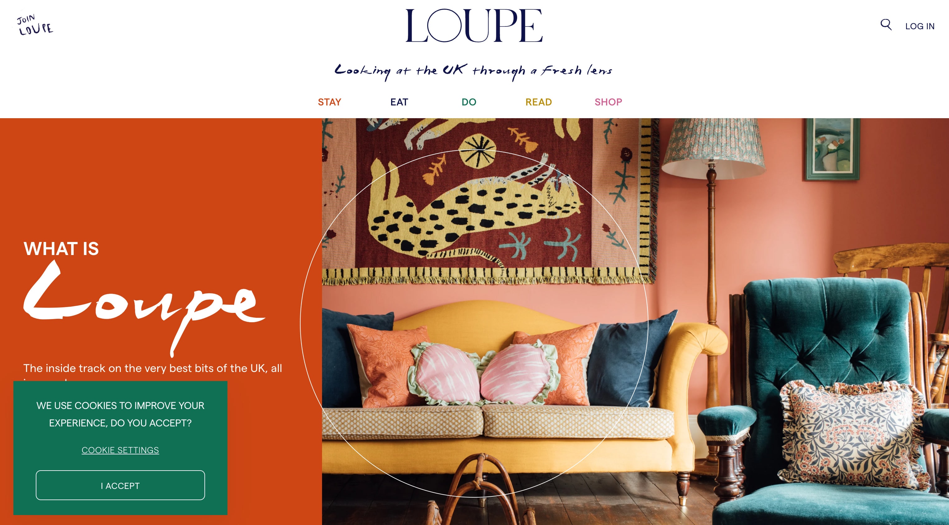
Overall, this banner’s distinctive style is a noteworthy design example that captures attention effectively.
About Loupe
Loupe is an online destination aimed at people who are looking for shopping, dining, reading, and travel inspiration. Their tagline is “looking at the UK through a fresh lens.”