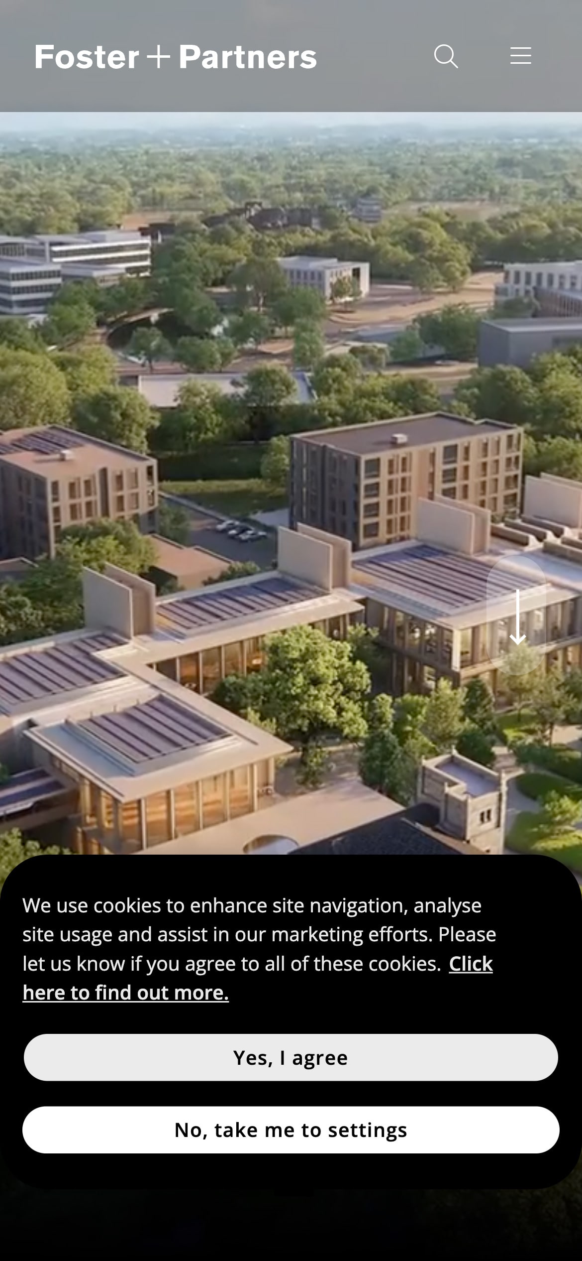
Think of this cookie banner as the digital doorman, ushering you into the website’s content and features.
Like the interior of a room before you flick the switch, this cookie banner boasts a rich black color. The use of black, often intimidating in large swaths, is here a statement, suggesting that even the most utilitarian aspects of a site can be designed. This deep black hue and rounded edges contribute to a sleek and professional appearance.
As for the buttons to accept or customize cookies, their high contrast with the banner ensures they’re immediately noticeable, and their rounded shape is consistent with the banner's design language.
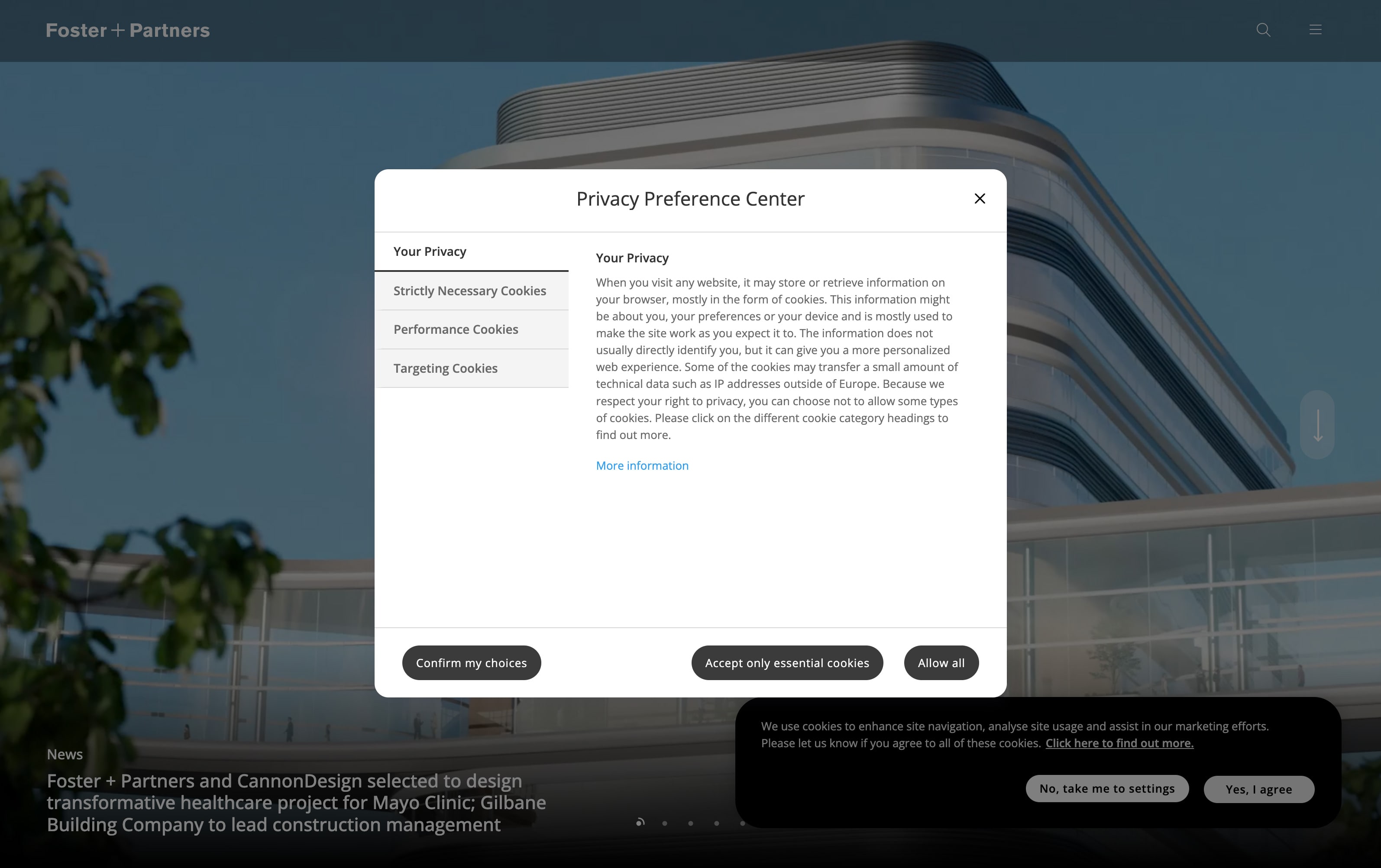
However, as you venture deeper into the settings the design appears to lose some of its initial impact. The proportions deviate from the classic rules of thirds or quarters (for example) which might leave a visitor feeling slightly off-kilter. Additionally, the choice of dark gray for the secondary buttons could be a missed opportunity to maintain the strong black-and-white theme established by the primary cookie banner.
Despite this, Foster’s commitment to user choice and regulatory compliance is as foundational as the concrete in a skyscraper. In essence, the cookie banner serves as an extension of their architectural philosophy, where every element is considered, and choice is paramount.
Foster + Partners
Foster + Partners is a British architecture firm. They specialize in sustainable architecture, urbanism, engineering, and design. They’re known for their iconic projects in urban planning, and their iconic buildings and structures worldwide.
Visit Foster + Partners