Let’s face it: cookie banners are often dismissed without a second glance, and that’s a design problem. More than just a mundane task, designing a cookie banner presents a unique opportunity to engage users. The all-too-common scenario where users overlook these banners is usually a result of poor design and misalignment, making them feel like afterthoughts—quite literally.
This neglect becomes more apparent when a lackluster cookie banner appears on an otherwise well-designed website, creating a jarring user experience. It’s often one of the first interactions people have with a website, so getting it right is essential. This article is your guide to crafting a cookie banner that not only considers privacy standards but also captivates and delights your visitors. The goal? To ensure users appreciate the privacy protection they’re afforded and enjoy using a thoughtfully designed banner.
Think of this piece as your roadmap to creating an engaging cookie banner. By combining the insights and creative examples showcased in the gallery, you’ll have the tools and inspiration to make a statement that resonates with your website’s audience.
However, it’s important to remember that the advice provided here serves as guidance rather than hard and fast rules. This information, while detailed, is not exhaustive, and please note, it doesn’t constitute legal advice.
Understanding the types of cookie banners often found on websites
In the digital privacy landscape, there are various types of cookie banners that websites use to inform visitors about their use of cookies.
-
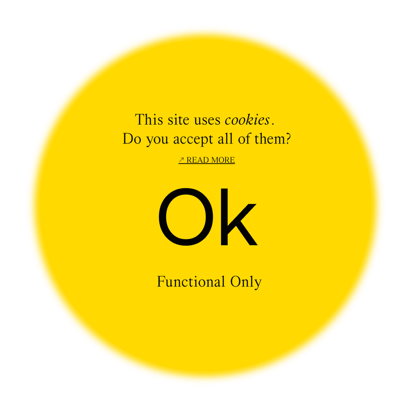
Notice-only consent banners: These let you know that the website is using cookies. There’s no button to click for acceptance or rejection, often simply an “Ok” button will be present.
-
Implied consent banners: These banners are a bit friendlier, asking if you’re alright with cookies. But even if you don’t explicitly agree, similar to notice-only consents, continuing to use the site or clicking around is regarded as your acknowledgement of cookie use.
-
Explicit consent banners: This kind requires you to take a clear and direct action to show your consent for cookie usage. Actions like ticking a checkbox or toggling a button are standard practices. Until you give explicit consent, the website won’t use any cookies.
-
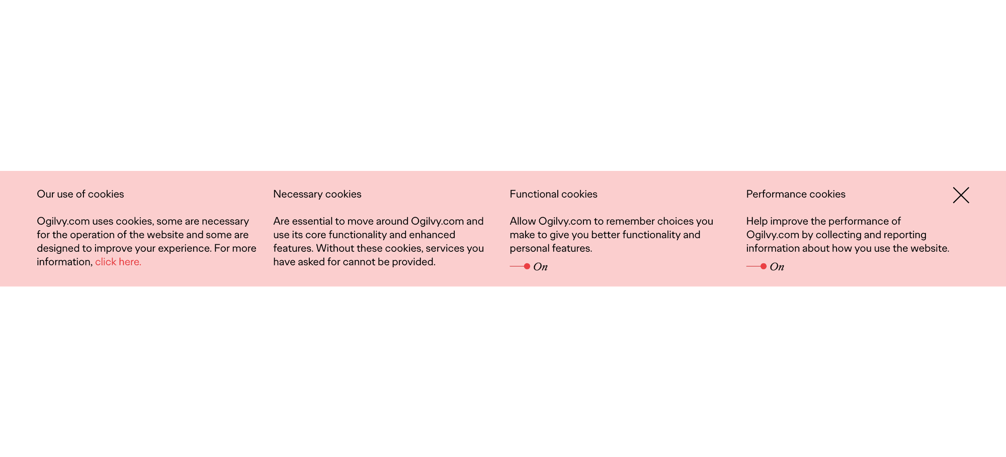
Comprehensive consent banners: These banners go the extra mile by providing detailed information about the different types of cookies used on the site. They allow you to accept all cookies or to customize your preferences. This often includes options to opt-out of non-essential cookies. Comprehensive consent banners are designed for maximum transparency and strict privacy regulations.
Legal and regulatory considerations for choosing a cookie banner type
To determine which type of cookie banner previously mentioned is right for your website, you’ve got to consider the data privacy laws applicable to your audience’s location.
In the United States, specifically California, refer to the
California Consumer Privacy Act (CCPA) and the
California Privacy Rights Act (CPRA). These laws, enforced by the Office of the Attorney General and the California Privacy Protection Agency, respectively, set standards for how personal information is collected and used, which impacts cookie banners.
In the European Union, the
General Data Protection Regulation (GDPR) is the overarching regulation covering data privacy. It’s important to understand that GDPR isn’t limited to EU countries though; it applies to any website that processes the personal data of EU residents. However, there is debate and some legal uncertainty about the enforceability of GDPR on sites based outside the EU, like those in the U.S.
In the United Kingdom, GDPR is amended by local regulations as administered by the
Information Commissioner’s Office (ICO). The ICO is helpful for understanding how GDPR applies in the UK.
But, for the most tailored advice, especially if your site caters to a global audience, ask a legal expert specializing in data protection. Alright, we’ve gotten through the dry stuff about types and laws around cookie banners. Now, let’s jump into what you’re here for.
Making Compliance Look Good
This is where you get to blend compliance with creativity. Designing your cookie banner is not just about following rules; it’s an opportunity to enhance your website’s look and feel while effectively communicating with your visitors. So, let's roll up our sleeves and dive into making your cookie banner not just user-friendly, but distinctive too.
First things first: avoid clashing with chatbots and other elements
In web design, the placement and interaction of various elements on a website, like cookie banners, chatbots, and other floating interface elements, require careful consideration to avoid overlap and ensure a smooth user experience. To prevent this, designers should think about and/or strategize with their web developer to understand whether and where these types of addons may occur. For example, if a chatbot has to be positioned at the bottom right of the page, the cookie banner should be placed elsewhere, like the left or bottom center of the page. But, designer’s should be aware, often the location of a chatbot icon can be moved, you just have to ask.
Where to place your cookie banner
Speaking of position, the location on screen of your cookie banner has an impact. And, a nicely designed cookie banner has to relate to the design of the website it’s on. This also plays into whether or not it grabs a viewer’s attention right away, or if it sits quietly tucked in a corner until people’s eyes naturally land there. In an analysis of cookie banner placements featured here on the Cookie Consent Gallery, the data reveals a clear preference for specific screen locations. Here’s where websites usually place cookie banners and how you can use this information to your advantage.
-
Bottom center: A notable 32% of cookie banners are located here, indicating the strongest trend for this placement. For this reason, cookie banners placed here can either be seen fairly quickly in the overall viewing order of page content, or fall prey to banner blindness—the overlooking of cookie banners due to their ubiquity across all websites. The outcome largely depends on whether the banner blends in with the surrounding content. Size, color, style, etc., are key factors to consider. This placement is ideal for banners that need to be noticeable and actionable, often without disrupting the user’s browsing experience.
-
Bottom right: Coming in second at 22%, this placement is fairly common. As mentioned earlier, when you place a cookie banner here, make sure that it doesn’t impede any other functionality on your website, like a live chat feature. This spot is often used for less intrusive, yet still visible notices, as it’s traditionally a space for additional information or secondary actions.
-
Center, or full screen: Coming in slightly below the bottom right at 21.5%, these types of cookie consent banners open to cover the entire screen. They preclude people from advancing to your website’s content until they either consent to, dismiss, or customize their privacy options (if your cookie banner requires it.) Conventional design wisdom suggests implementing your cookie banner in this way versus the bottom right is likely due to regulatory requirements.
-
Bottom left: Though tied with the center or full-screen placements at 21.5% and slightly behind the bottom right’s rate of 22%, preference for this location is nuanced. It’s important to understand that websites are typically viewed in a Z pattern, where the eyes move from top to bottom and left to right. Similarly, when people skim web pages, they follow an F pattern. This involves a horizontal scan at the top, followed by another horizontal movement slightly below, and finally a vertical scan down the left side of the page, resting in the bottom left corner. With this in mind, the bottom left corner is a good location if you want to place your cookie banner in an unordinary place but still have people notice it.
-
Top center: Coming in last at a mere 3%, this placement is not too popular, and that’s often for good reason. A cookie consent banner at the top of a page, while it does attract attention right away, can throw off the balance of a design quickly. If you opt for this location, you’ll want to make sure it works visually alongside other common elements like primary navigation.
Breaking the mold
While we’re on the subject of making an impact, standing out means trying something different. Cookie banners often lean into the cookie theme—a clever nod to both the treat and online privacy. It’s a fun, well-known pun. But as the digital world shifts away from 3rd party cookies (with first-party cookies sticking around for now), we might see new, more inclusive terms emerging like Data Token, or Web Beacons. At a minimum, cookies as a thematic element are a bit tired. Here’s how others are making a statement, and a few thought-starters to get you in the creative zone.
Take
Declamatuus, for example, who adopted a Pharaoh theme. Their cookie banner message, ‘The spy pharaoh wishes to account for your visit,’ adds an intriguing twist of storytelling to the mix. Also remember, the style of your cookie banner really matters. If you go for an all-black banner and it’s on a dark background, it’s just going to blend in. Not great if you want it to stand out, right?
Other inventive ideas include a garden concept that depicts data privacy with lush vegetation, or visualizing data as pieces of a digital puzzle that fit into the larger online experience. Even a digital library concept, where data is treated like a book that users have control over who “check out,” stands out as a novel idea. Whichever route you choose, keep in mind that it should align with your website’s theme, industry, or brand for a seamless integration. Are you starting to see how sticking to a cookie theme is not your only option?
Language and UX writing
Before we tune into the finer details, let’s set the stage: the right language and UX writing can turn ordinary notifications into engaging dialogues. Here’s how you can elevate your cookie banner through effective communication.
-
Start with the headline: Yes, “We use cookies” is clear, but it’s also a bit boring. Your banner’s headline should inform and resonate with your audience. Consider Rivian’s approach above, using “We Respect Your Privacy.” It’s a thoughtful touch. Other options like “Your Privacy Matters to Us” or “Committed to Your Privacy” can similarly convey care and respect.
-
Go beyond the what, explain the why. A well-crafted headline is just the beginning. You’ve got to make sure your cookie banner does more than just let people know you’re committed to your users’ privacy. In the current landscape, it’s vital for cookie banners to serve as educational tools, enlightening users about the use of their data and the advantages it brings, like enhanced personalization and seamless website functionality. Website designers and owners must communicate the mutual benefits: users get a tailored experience and improved service in exchange for sharing their data.
-
Use progressive disclosure when possible. Progressive disclosure involves revealing information in layers, providing users with only what’s necessary at first, then offering more details as needed. Where it makes sense, include a link to your full cookie policy where users can get detailed information about how cookies are used on your site.
-
Focus on clear calls-to-action. When it comes to CTAs, clarity should always be the focus, especially in certain compliance contexts. Use straightforward language like “accept cookies” or “decline cookies” (if your cookie banner provides those options). This ensures that users understand their choices and is also vital for people using screen readers, as it helps them grasp the function of each button as it’s read out loud. Avoid using negative opt-out language like “no thanks, I don’t like relevant ads,” as it can come across as condescending.
Finally, use a tool, or get a pro involved if crafting the perfect message is challenging—don’t hesitate to use AI writing technology or hire a copywriter to help. The right wording can make a significant difference.
Typography’s role in web design, including cookie banners
Have you ever seen those cookie banners with tiny, mismatched fonts that just don’t fit with the website’s design? They’re easy to spot and even easier to ignore. Which brings us to our first type tip: consistency.
Most websites are built around a design system, why not use it on your cookie banner too? However, if you do have a design system and decided not to use it, be doubly sure that you have a good reason. The key is to complement, not clash with, your website’s existing style.
When considering text alignment in your cookie banner design, explore options like left, center, and right alignment to find the best option. Left alignment is the safe choice for readability—it’s a no-brainer. Though, if you decide to use justified text (where both the left and right edges are straight), be wary. While justified text gives you a uniform look, it usually creates distracting gaps between words.
Combining different fonts like serif with sans serif creates a timeless and appealing look. Or consider pairing monotype with serif fonts for a more technical, modern effect. Sometimes, simply using bold and light variants within the same font family can achieve a striking yet cohesive hierarchy. Sound good? Ok, let’s move on to something that might involve a bit of teamwork.
Accessibility matters in cookie banner design
No cookie banner design is truly complete without considering accessibility. Ensuring that all users, regardless of their abilities, can navigate and understand the choices in your banner is very important. While perfecting every design and accessibility detail is challenging, often requiring collaboration between multiple parties like web designers and developers, striving for this goal will pay off. Here are some essential accessibility considerations:
-
Keyboard navigation: Make sure your cookie banner is easy to navigate with a keyboard. Users should be able to zip through using “Tab” for hopping between choices and “Return” to pick an option. Keeping things user-friendly and in line with basic web accessibility norms is the target.
-
Screen reader compatibility: As previously mentioned, but worth repeating, banner buttons should be screen reader-friendly. For designers, this means crafting clear and engaging CTAs. For the technical team, it means using semantic HTML and ARIA roles to make sure these elements are accessible to everyone.
-
Visible focus state: Interactive elements in the banner should have a clear focus state. This helps keyboard users identify which element they’re interacting with. But, most web browsers automatically outline focused buttons, which might save you some custom design work.
-
Contrast and legibility: This is one of the easiest items to fix from a design perspective, yet, often overlooked or simply designers aren’t on board with learning about and continuing to adopt accessible color palette habits. Text and elements in the banner should meet the Web Content Accessibility Guidelines (WCAG) for color contrast. This ensures that text is legible and distinguishable from the background for users with visual impairments.
-
Alternative text for images: If your cookie banner uses images, include descriptive alt text for those who can’t see them.
Wrapping up cookie banner design. But there’s more to come.
So, you’ve got the lowdown on designing a top-notch cookie banner. But hold on, there’s more to this story. In the next installment, we’ll dive into how to create a settings screen that’s as engaging as possible for a topic like data protection. We’re talking about turning compliance into curiosity and knowledge about data privacy choices. So, stay tuned for more tips and strategies in part two.
In the meantime, why not take a little detour through the
Gallery? It’s packed with fantastic examples of cookie consent banners from a variety of websites. This is the playground for observation, learning, and inspiration, showcasing how other talented designers have seamlessly blended cookie banners into their web design. Get ready to be inspired!
Authored by
Jonathan Patterson, a seasoned freelance product design generalist with nearly two decades in advertising, marketing, and product design. Jonathan brings a wealth of experience in launching data-driven B2B and B2C experiences, reflecting his extensive career in the industry.