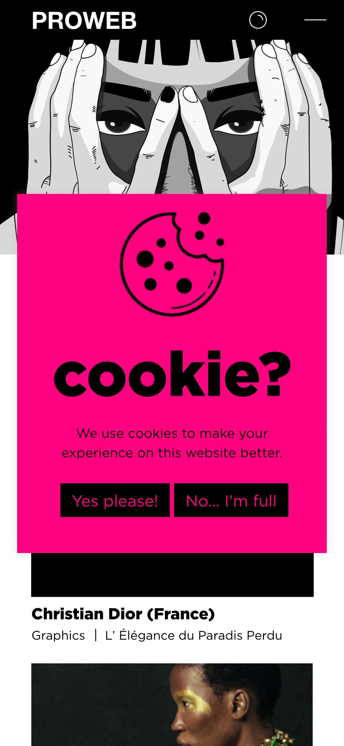
Pro Web’s cookie banner is prominently placed and does not blend into the background, which is good for ensuring that users notice it.
Furthermore, for maximum banner impact, they’ve centered it smack dab in the middle of the screen. They've also gone the extra mile to ensure it makes the most of that prime real estate.
Opting for a vibrant shade of hot pink (#FF007F) with black text also guarantees that the banner demands attention. However, it’s important to know that pink can have varying meanings depending on where and when you find yourself. Also, this contrast ratio can give your eyes a little workout. That said, this choice of pink, combined with the black text does meet the WCAG AA guidelines with a ratio of 5.55:1.
The playful wording of the options “Yes please!” and “No... I’m full” adds a touch of engagement to the experience. However, clarity is crucial; users need to easily grasp that “No... I’m full” equates to declining cookies. It appears that this choice leans more towards creative design thinking rather than focused UX writing. Still, this design is a great example of creativity.
About Pro Web
Pro Web is a digital agency that creates websites and e-shops, alongside expert branding and digital marketing services. Their approach incorporates web design, digital strategy, SEO, social media marketing, and mobile app development, all aimed at making strong connections between brands and people.
Visit Pro Web